Tuesday 27 September 2011

Magazines & Audiences Part 2.


In this analysis I will be overlooking who the target audience is for the magazine cover, how the magazine cover has attempted to appeal to them and what conventions of cover design are evident. 
I feel that this magazine cover's target audience is females as the colours they have used to create the layout are more suited to females as they are pink, grey and white. The colours are used to attract female attention so make them want to buy it. The colours will appeal to women more than men this is because we normally link colours like pink to women.
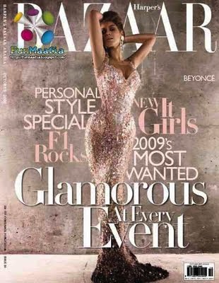
The Image on the front of the magazine cover would mostly appeal to women because she is an idol to young women this is because she’s a big star in the UK and USA and has a lot of younger fans. The Age group this will appeal to would be from any age but would range from the 15-24 mark; this is because there are many young fans of Beyoncé and they are more likely to read magazines like this.
The cover has attempted to appeal to the target audience by using a big star like Beyoncé this creates a big appeal as she is a well known star across the world and many people enjoy her and her music. They have also tried to appeal to the target audience by using different fonts in the sub headings to create more effect which draws the reader in and makes them want to read more.
The conventions of cover design used in this magazine cover are that they have used a strong masthead on the cover. It’s bold so it’s easy to read, it’s white so it stands out to the background, it’s big so people will recognize it automatically and it’s a different font to the others on the front cover. They have also used a main image for the front cover, this shows that they want the star to be noticed and for people to notice the famous idol so it will attract more people if they know who the star on the front cover. They have used cover lines on the cover of the magazine and it’s outlining Beyoncé’s body to make her stand out and it’s not taking the focus off her image it’s complimenting it.

Glossary of terminology that is associated with magazine design.

Glossary
-Terminology that is associated with magazine design.


Masthead

  • The name of the magazine displayed in the typeface in which it is designes. This is the visual branding of the title and is usually done in a unique typeface to be very recognisable.

Dateline

  • Month and year of publication, often with the price. Note that a monthly magazine usually hits the news-stands a month before the cover date.
Model Credit

  • This says 'Shania:so hot.' It is unusual for such a credit to appear on the cover.
Coverlines

  • Cosmopolitan uses a lot of cover lines, which are distributed around the main image without detracting from it too much.
Main cover line

  • this is very large- taking up about a quarter of the cover area - and comes in three layers, each with a different colour. It promotes the use of naked male centerfolds, a feature of Cosmopolitan in the UK since its first issue. Note it is positioned against the models shoulder so it shows up clearly.
Left Third

  • In westen countries, the left third of the cover is vital for selling the issue in shops where the magazine is not shown full-frontage. The tittle must be easily recognisable in a display of dozens of competitors. The start of the masthead is important here.
Bar code

  • standard barcode used by retailers.
Selling Line

  • Short, sharp description of the title's main marketing point ('The world's No 1 magazine for young women') or perhaps setting out is editorial philosophy.


Callout
  • text from an article that is displayed on a page to entice readers and break up a page visually.
Cover Mount
  • A gift stuck to the front cover of the magazine.
Footer
  • In wordprocessing, the line of text that appears below the main text area. Usually used for page number, date, etc. 
Keyline
  • Line of space around an images to separate it from other elements.
Sells
  • Sentence after a headline and before an article begins that 'sells' a feature to a reader. Used in NatMags job advertising as 'heads and sells'. A standfirst.
Sidebar
  • short article related to main topic on page, usually in a box or given a special typographical treatment.
Tip-on
  • card or other object stuck on to a page.


How I think blogger will be useful for my coursework.

How I think blogger will be useful for my coursework.

  • It's user friendly- helpful for my coursework as its easy to upload work that i have done.
  • It's easy to update and make changes to, even from different computers.
  • Quick, fast and easy.
  • I am able to gather feedback from others that view my post.
  • Teachers will be able to view my work online and give me feedback.
  • It lets me see previous work that i have done so i can see how to improve it.
  • It will let me view other posts so i can gain inspiration from others.
  • The layout of blogger could potentially help me understand my coursework easily.
  • It's a place to store my coursework without a fear of it getting lost.
  • Other people can view my work more freely.

Things you can do with blogger.

Things you can do with blogger.

  • Journal their thoughts and ideas
  • Record their dreams
  • Post their photography
  • Create an interactive community where people can collaborate on their projects
    Promote family reunions
  • Position themselves as experts in their field
  • Write books and have their material critiqued by interested readers
  • Sell their products and services
  • Promote themselves and their projects
  • Survey their readers
  • As a substitute for newsletters and bulletins
  • And a million other things.
http://www.recognizedexpert.com/blogger/amazing-things-you-can-do-with-a-blog-333.html 

Tuesday 20 September 2011