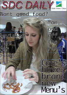
In this lesson we had to fiddle around in InDesign. first of all i uploaded my main image which would be my front cover. i then created my masthead and decided what colour i would make it. then created my main cover line and decided that it should be a different colour to the other cover lines so it would stand out more and catch peoples eye.
We specifically learnt how to use:
- the text tool
- how to change the font,colour,size and effects
- how to insert images for the cover image and the logo.
I think that my cover page is good because all the title colours match and it fit in well with the picture colours (it stands out)
The software that i left how to use today was really easy to pick up and i will be able to remember it easily.

This looks great so, try to move the coverline under the masthead down a little. Also try some different fonts and colours.
ReplyDelete