Tuesday 13 December 2011

Magazine Ideas

who are you aiming your music magazine at?

  • i am aiming my music magazine at people ages 16-24 mainly people who enjoy pop music and they will be based at males and females.
what musical genre will your magazine be from?
  • i will base my music magazine around pop music - the audience will know this by the style of the main image, the different bands/artists used and the coverlines
What Title have you decided on and why?
  • I have decided to name my magazine 'LabelUK' because its catchy and represents the genre of music that the magazine is about.

What fonts do you want to use?


What are your ideas for a tagline?
  • I am not going to use taglines on my front cover.

What kind of image do you expect to put on he front cover?
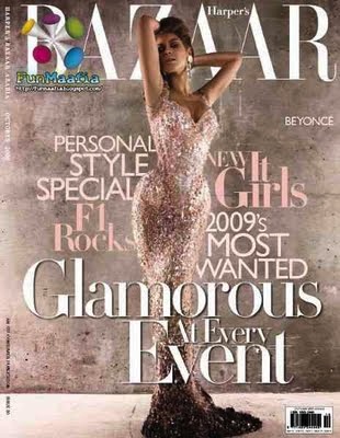
  •  am going to re-create a cover image of adele on the Q magazine but with a model of my own.

How much would your magazine sell for?
  • My magazine will sell for £3.99

what are your ideas for cover lines?


what images do you expect to use on your contents page?


What will your DPS be about? What are your initial ideas for images?

Main Image Ideas

for my main image i am going to try and re-create something like this cover:


  • My image will be portrait so it takes up the whole cover page and if i took it landscape then i would have to squeeze it into an A4 page which wouldn't look good.
  • The main image on my front cover will be a head shot/close up of the artist and i will use the fan effect so her hair is blowing around.
  • I will put my image in colour because i feel that it would draw more people in and would look better than black and white.

  • My Front Cover will have the masthead in the left hand corner. 
  • The main colours on the front cover of my magazine will depend on which colours i use in my main image.
  • My main coverline will be the name of the artist and what the inside story is about-(my two page spread)
  • my other cover lines will be based around different things that will interest people like new releases from different artists, different concerts coming up and interviews with other artists.


Tuesday 6 December 2011

Today i created a Questionnaire to hand around the class for them to fill out which would help me get an idea of what to do for my magazine.
here is the questionnaire that i created:

After i got all of my questionnaires back i then made a results table to show me what others in my class think i should do.
Here is my results table:

Today i think that i have worked out what i will be basing my magazine on i have also thought about what i will put into my magazine, how much the magazine will cost, what will be on my front cover and what the name of my magazine will be called

I will base my magazine on Pop/Indie
I will have a 2 age spread on an article of an artist and their new realeases
i will have a main image, mast head, coverlines and article information on my front cover
I will price my magazine at £3
I will call my magazine LabelUK

Tuesday 29 November 2011

Billboard Magazine Covers


I am going to focus my magazine on pop artists.
I would like to call my magazine something that will stand out and be remembered so i came up with the name: Label UK. this will be in 'TIMES' font and black/white depending on the colour of the background of the photograph.
my front cover will have be a main image of a 'celebrity' in which i am going to re-create one of these stars or i will make up my own star and photograph them in different poses/costumes.
There will be one main colour which might be the colour of her clothing or the colour of her eyes.
My Cover lines will be in 'Verdana' font and also in Italics. it will also be blue/green or red writing because it will either be the same colour as her eyes or dress.


Tuesday 22 November 2011

FINAL Contents page


Here is my Final Design of my Contents page:


i made my final design exactly like i wanted it to look with two images on the right and one image on the left i felt that i should stick to my plan because it was simple but still looked good.
I made the background image fade in with the background because otherwise it would have looked too busy and i waned the other 3 images to stand out because more people are attracted to it.

Tuesday 15 November 2011

Contents Planning

Here are the plans of my contents page:
    

  • i want the background to be an image of the college entrance.
  • i want the font to be in 'italics'.(not masthead)
  • i want the masthead to be in bold and in 'TIMES' font.
  • i want the font of the writing in the boxes to be blue or red.
  • i want the font to be in 'ARIAL'.
  • i want the images to have rounded edges. 
  • i want the text to have a box around it.
  • i want my images to have subheadings on them.

FINAL-front cover

15/11/11:
Today i finish my final plan of my cover page. i chose to change the colours of the wording i used and make the title of the magazine and the main cover line of the magazine bold colours that will stand out. because they are both different to the other cover lines.

Here is my final design of my front cover:

Tuesday 8 November 2011

preliminary task student magazine - front cover


In this lesson we had to fiddle around in InDesign. first of all i uploaded my main image which would be my front cover. i then created my masthead and decided what colour i would make it.  then created my main cover line and decided that it should be a different colour to the other cover lines so it would stand out more and catch peoples eye.
We specifically learnt how to use:

  • the text tool
  • how to change the font,colour,size and effects
  • how to insert images for the cover image and the logo.
I think that my cover page is good because all the title colours match and it fit in well with the picture colours (it stands out)
The software that i left how to use today was really easy to pick up and i will be able to remember it easily.

Prelminary Task

  • i'm aiming my magazine at young teens at college.
  • My magazine will be about events, trips and interesting things happening around college.
  • my ideas for my cover lines are going to be about he food at college and trips in different subjects happening soon.
  • my ideas for covers lines are "new trips announced", "Cafe's have brand new menus"and "college trip reviews from SDC students"
  • I have decided on the title and it will be called 'SDC Daily' i chose this because it is based around the college and it has daily updates on recent things and things that are happening soon. i was thinking of calling it 'SDC news' but i didn't think it was as catchy, i also thought of calling it 'SDC announcements' but it just doesn't fit right.
  • i want to use a simple font on my cover page so it will either be ARIAL, GEORGIA or VERDANA. i definitely want to use ARIAL for my Masthead because its simple and easy to read.  SDC DAILY


  • i won't be using taglines in my magazine design.
  • My  magazine will be issued in winter because it's the start of the year and new students will want to know about these sort of things.

Tuesday 18 October 2011

IPC Case Study.

http://www.ipcmedia.com/about/companyhistory/


Hisotry
1800's - The Field was the first newspaper launched in 1853 with 24 pages. within a year it became the largest newspaper in Europe. It had its own creator throughout the Crimean War and its November 18, 1854 issue ran a sequence of personal histories of those who took part in the Duty of the Light Brigade.

Competitions played a main part in sales advertisings for all early IPC headings, and nothing more so than the extraordinary prize offered by the inexperienced magazine, Answers, in 1889 – the then unheard of fortune of £1 a week for life to any reader who could guess the amount of gold and silver in the Bank of England on a specified date.


Early 1900'sThe first of the new century saw the arrival of three titles set to become part of IPC Media many years later – Yachting Monthly, Cage Birds and Motor Boat.
1920's - Woman & Home entered the market in 1926, and by its third birthday in 1929 had grown to a steady 144 pages, majoring on fiction.
Odhams launched the new monthly Ideal Home in opposition to Newnes' Homes & Gardens


1940'sA key wartime role was played by IPC's women's weeklies, keeping up the morale of Britain's women and supplying an essential information service on behalf of the Government.


1960'sLife for magazine staff would never be the same again following the 1963 formation of theInternational Publishing Corporation, bringing together the three rival magazine companies,Newnes, Fleetway and Odhams Press. Traditional competitors found themselves all working for the same parent company – Ideal Home and Homes & Gardens, Woman and Woman's Own, to name but a few.


1980's - IPC announces the formation of European Magazines Ltd., a joint venture company with Groupe Marie Claire to launch the UK edition of the international title in 1988.
IPC embarks upon the biggest sales campaign in its history, spearheaded by 21 of its top editors – the first ad features 'Four of Britain's Most Influential People' – the editors of its women's weeklies.


2000'sNew millennium, new name – IPC Magazines is renamed IPC Media in 2000, a new identity to go hand-in-hand with a strategy based on being a brand-centric business.
IPC Media develops great new digital media brands such as housetohome, goodtoknow andshooting UK.


Publications they have been associated with:


Tuesday 4 October 2011

To what extent should magazines be held responsible for the social ramifications of the representations they offer?


In each of the magazine covers i have chose the similarities are:
1)well known famous star on the cover.
2)3 basic colours on the covers.
3)have coverlines.
4)have a bold masthead.
5)have a number on the front cover in bold.


To what extent should magazines be held responsible for the social ramifications of the representations they offer?

The extent in which magazines should be held responsible for the social ramifications of the representations they offer is they are responsible for almost 90% of it.

Almost every magazine has “sexually-explicit material which is potentially in breach of the industry's editorial code.” Many complaints have been made to a variety of teen magazines, as they believe that magazines are teaching 11-15 year olds to look the ‘right’ way, most teen magazines have many different cover lines with things like; "Dress to impress." "Easy hair makeovers." "Find the perfect hair, makeup, and style for you!" "Be a knockout!" This is ‘brain washing’ teens and making them feel like they don’t look ‘pretty.’ Most teenage girls take this to heart and make them want to change something about themselves to make them look ‘good.’

I don’t think the “sexually-explicit” material should be totally removed from teenage magazines, I think that they should only put small amounts of it in a few pages of the magazine and try and make it less “sexually-explicit”.
I think that magazines need to cut down on how many ‘new looks’ they put in the magazines as its making teenage girls feel as if they’re not pretty and want to look like the people in the magazines.

I feel as if magazine cover lines need to be replaced with something simple but catchy but not sexual/raunchy. Some images used in the magazines and covers are a bit too revealing so I think that the magazine companies need to take a step back on it and make them wear fashionable clothing which will inspire the teens instead of making them envy all of the stars with amazing clothes which are large amounts of money. Hair and Beauty tips need to be left as simple things like easy things to do for people ages from 11-15. 

Many people will agree that teens are being shown promiscuous things in magazines and turning them into something they’re not, its making them wear clothes that are suited for older teens, making them wear more make-up than needed and making them look fake.

I conclude that magazines need to cut down on the amount of fake things they put into magazines, stories that are sexually explicated and images that are too raunchy for teens to see.


(quotes taken from)

Tuesday 27 September 2011

Magazines & Audiences Part 2.


In this analysis I will be overlooking who the target audience is for the magazine cover, how the magazine cover has attempted to appeal to them and what conventions of cover design are evident. 
I feel that this magazine cover's target audience is females as the colours they have used to create the layout are more suited to females as they are pink, grey and white. The colours are used to attract female attention so make them want to buy it. The colours will appeal to women more than men this is because we normally link colours like pink to women.
The Image on the front of the magazine cover would mostly appeal to women because she is an idol to young women this is because she’s a big star in the UK and USA and has a lot of younger fans. The Age group this will appeal to would be from any age but would range from the 15-24 mark; this is because there are many young fans of Beyoncé and they are more likely to read magazines like this.
The cover has attempted to appeal to the target audience by using a big star like Beyoncé this creates a big appeal as she is a well known star across the world and many people enjoy her and her music. They have also tried to appeal to the target audience by using different fonts in the sub headings to create more effect which draws the reader in and makes them want to read more.
The conventions of cover design used in this magazine cover are that they have used a strong masthead on the cover. It’s bold so it’s easy to read, it’s white so it stands out to the background, it’s big so people will recognize it automatically and it’s a different font to the others on the front cover. They have also used a main image for the front cover, this shows that they want the star to be noticed and for people to notice the famous idol so it will attract more people if they know who the star on the front cover. They have used cover lines on the cover of the magazine and it’s outlining Beyoncé’s body to make her stand out and it’s not taking the focus off her image it’s complimenting it.

Glossary of terminology that is associated with magazine design.

Glossary
-Terminology that is associated with magazine design.


Masthead

  • The name of the magazine displayed in the typeface in which it is designes. This is the visual branding of the title and is usually done in a unique typeface to be very recognisable.

Dateline

  • Month and year of publication, often with the price. Note that a monthly magazine usually hits the news-stands a month before the cover date.
Model Credit

  • This says 'Shania:so hot.' It is unusual for such a credit to appear on the cover.
Coverlines

  • Cosmopolitan uses a lot of cover lines, which are distributed around the main image without detracting from it too much.
Main cover line

  • this is very large- taking up about a quarter of the cover area - and comes in three layers, each with a different colour. It promotes the use of naked male centerfolds, a feature of Cosmopolitan in the UK since its first issue. Note it is positioned against the models shoulder so it shows up clearly.
Left Third

  • In westen countries, the left third of the cover is vital for selling the issue in shops where the magazine is not shown full-frontage. The tittle must be easily recognisable in a display of dozens of competitors. The start of the masthead is important here.
Bar code

  • standard barcode used by retailers.
Selling Line

  • Short, sharp description of the title's main marketing point ('The world's No 1 magazine for young women') or perhaps setting out is editorial philosophy.


Callout
  • text from an article that is displayed on a page to entice readers and break up a page visually.
Cover Mount
  • A gift stuck to the front cover of the magazine.
Footer
  • In wordprocessing, the line of text that appears below the main text area. Usually used for page number, date, etc. 
Keyline
  • Line of space around an images to separate it from other elements.
Sells
  • Sentence after a headline and before an article begins that 'sells' a feature to a reader. Used in NatMags job advertising as 'heads and sells'. A standfirst.
Sidebar
  • short article related to main topic on page, usually in a box or given a special typographical treatment.
Tip-on
  • card or other object stuck on to a page.


How I think blogger will be useful for my coursework.

How I think blogger will be useful for my coursework.

  • It's user friendly- helpful for my coursework as its easy to upload work that i have done.
  • It's easy to update and make changes to, even from different computers.
  • Quick, fast and easy.
  • I am able to gather feedback from others that view my post.
  • Teachers will be able to view my work online and give me feedback.
  • It lets me see previous work that i have done so i can see how to improve it.
  • It will let me view other posts so i can gain inspiration from others.
  • The layout of blogger could potentially help me understand my coursework easily.
  • It's a place to store my coursework without a fear of it getting lost.
  • Other people can view my work more freely.

Things you can do with blogger.

Things you can do with blogger.

  • Journal their thoughts and ideas
  • Record their dreams
  • Post their photography
  • Create an interactive community where people can collaborate on their projects
    Promote family reunions
  • Position themselves as experts in their field
  • Write books and have their material critiqued by interested readers
  • Sell their products and services
  • Promote themselves and their projects
  • Survey their readers
  • As a substitute for newsletters and bulletins
  • And a million other things.
http://www.recognizedexpert.com/blogger/amazing-things-you-can-do-with-a-blog-333.html